



Google is testing a new product grid layout in Search that shows three items per row instead of the usual five, and expands to four or five when a user clicks. The change gives each product more visual space at rest while keeping a denser view available for shoppers who want to scan more options. Merchants and SEOs tracking shopping visibility now have another grid format to watch.
What the three-product grid looks like
The test replaces the default five-item row with a tighter three-item row in the more products section of a Google Shopping result. Each tile has more room to breathe, which can change which product image, price, and merchant name a shopper notices first. In a video shared on X, the grid is shown shrinking and growing in response to a click, then settling back to three across.
Clicking a product opens a larger product box inside the grid, with the rest of the items still visible to the side. The interaction keeps the shopper inside the result rather than navigating to a separate product page, which is the same pattern Google has been pushing across Shopping and AI Mode experiences.
How the grid expands and shrinks
The same test shows the grid adjusting its density on the fly. From the default three-up state, a click triggers a transition to a four-up or five-up view, depending on the variant. Going back returns the shopper to the three-item layout. A second variation was also spotted: when a product is clicked, the grid shows the chosen product in a large box with the remaining items arranged around it, rather than the standard four-product tile view.
The exact threshold for triggering the expansion is not public, and the available screen width, the device, and the product category all appear to influence which variant renders. Google runs these layout tests continuously, and only a fraction ever graduate to the default experience.
Why a smaller default grid matters for merchants
A three-item row is a meaningful cut from the standard five. The top three positions in any grid carry most of the click-through activity, so a tighter default can concentrate shopper attention on a smaller shortlist of products. For merchants, that means the position of a listing inside the grid carries even more weight than it did in a five-up layout, and the first row matters more than the rows that follow.
The expansion on click also tells Google how engaged the shopper is. A click that opens a larger product view is a strong intent signal, and the products shown alongside the chosen item in that expanded view are effectively endorsements from Google’s ranking system. Tracking which neighbours appear next to a product in the expanded view is a useful proxy for category-level competition.
How to track grid changes for your own products
Grid tests are visual, not query-based, so standard rank trackers do not capture them. The practical approach is to search the same product queries on multiple devices, in incognito mode, and from different locations, then screenshot the grid each time. Logging the number of products per row, the order, and the merchants shown builds a record of how a category is rendering for real shoppers over time.
Tools that map rank position across a service area can help here, because a single city-wide average hides the fact that a grid may render three items in one location and five in another. SEOScanPRO’s GEO Grids do this, showing which towns and suburbs a site is visible in and how the result layout varies by geography.
What to watch next
This is a test, not a confirmed change, and Google has not announced a timeline for rolling it out. The signals to watch are the same ones that indicate any Shopping layout change is sticking: a higher share of queries returning the new layout, fewer queries rendering the five-up default, and merchant reports of click-through shifts inside the grid. Until then, the three-up layout is one variant among several, and the safest read is to optimise product feeds for whatever Google decides to put at the top of a three-item row, not just a five-item one.
FAQ
What is Google testing in the product grid?
Google is testing a shopping grid layout in Search that displays three products per row instead of the usual five. The grid can expand to four or five products when a user interacts with it, and can also shrink back down to three.
How many products does the new grid show by default?
The default in the test is three products across, a reduction from the standard five. Clicking on a product opens an expanded view that shows the product in a larger box alongside other items in the grid.
Why is Google changing the number of products in the grid?
Google runs grid tests to see how different layouts affect user behaviour. Showing fewer products at a time gives each item more visual space, and expanding on click lets the test compare engaged users against the default dense layout.
Related coverage
- Google AI Search Box, Local Sponsorships and Review ROI in 2026
- Search Everywhere Optimization: Why Google Alone Isn’t Enough in 2026
- Google’s New AI Search Guidance: Why Non-Commodity Content Is the Only Strategy That Matters
SEOScanPRO
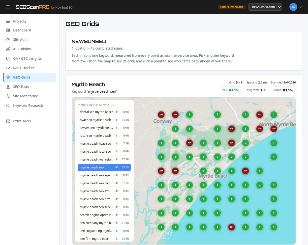
SEOScanPRO’s geo grid tool runs a full technical audit of a site and shows the measured result behind every check. Open the geo grid tool.
Want help with this in Myrtle Beach or Long Island? Talk to us.
NewSunSEO
Grow in Google and AI Search
AI-SEO, local search, paid ads and websites from one team, with offices on Long Island and in Myrtle Beach.
- AI-SEO
- Local AI-SEO
- AI Consulting
- PPC
- Web Design
- Web Development
- Long Island Office(631) 320-1700
- Myrtle Beach Office(843) 492-7131
Request a Free Proposal
Tell us about your business and where you want to grow.
We will reply by email to talk through your goals and what a proposal would include.
We use your details only to reply to you and send what you asked for. See our Privacy Policy.